
For the working class, real weekly wages haven't risen in 55 years.

There’s a longstanding attempt to find a single graph that captures just how stagnant the economic situation of Americans is. Owing to @DBrumus on Twitter I think I’ve found a winner. Here we have the following graph of:
(Average hourly pay, private sector employees, production & nonsupervisory)*(average hours worked by these employees) in nominal dollars, set to an index at 1970, vs (inflation) in nominal dollars, set to an index.
The short of it is that these employees, representing the vast majority of employees in the country [Essentially: private sector workers who are non-supervisors OR supervisors who work in production], haven’t gotten any richer in real terms in 55 years.

But is this because they’re working fewer hours- gradually cutting back on work as their hourly income increases? Lol no. It’s a little bit better when we just look at hourly rates, but not much:
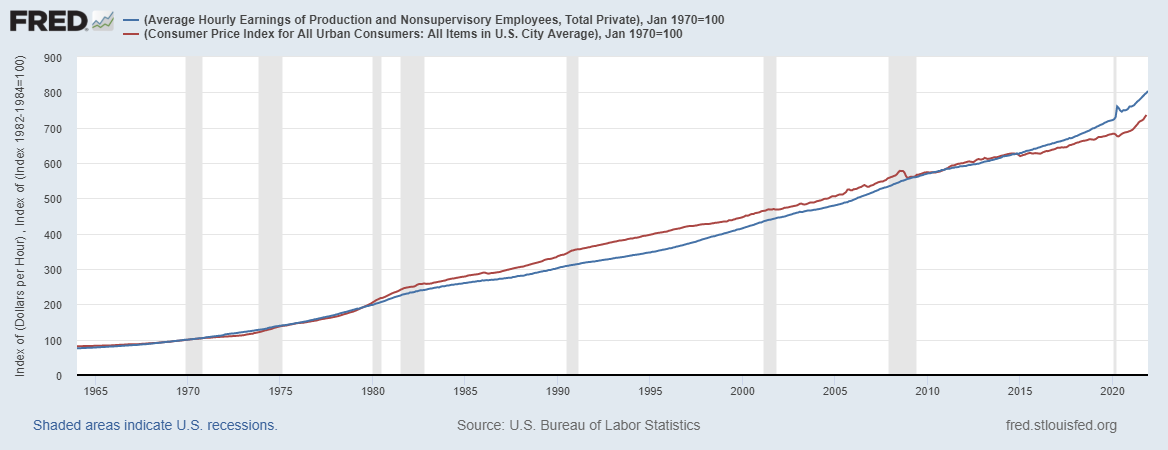
During that time real GDP per capita has nearly tripled.
Some people will object that this doesn’t include non-monetary compensation, most importantly healthcare. My response is that no one feels richer, or should feel richer because their workplace has to pay more in health insurance premiums.
Other people will point out that this is based on average not median hourly pay. This is true. If it were based on median hourly pay it would look much worse.
Edit: On medical costs and technology improvements
A couple of respondents didn’t like my blithe dismissal of healthcare cost increases, so let’s break this down in a little more detail. I think our summary above is fair- especially given its brevity and especially given other, much sloppier discussions that exist in the literature, but we’re not in the business of discarding reasonable criticisms around here, at least when I have time enough to reply.
We need to be very clear about what question we’re asking, and the underlying idea we’re putting to the test. I take it to be what we’re testing is:
A popular sense that the typical worker has been utterly left behind since after the end of the postwar boom
So is this true, and does our stat show it?
We started in 64’ This is a period during which, per capita, the economy tripled in size:

While wages have remained stagnant. So the main thing to keep in mind is that it’s very unlikely that healthcare costs are going to reverse our judgment. Healthcare costs are huge, but in this context they’re just not big enough- they’re not even close.
Now a couple of points to keep in mind.
Firstly, there have undoubtedly been improvements to the quality of healthcare in that period, but for a lot of people, perhpas a majority, those changes won’t matter much during their working lives. Many of the people whose lives have been transformed (extended especially) by improved healthcare are on medicare because they are over 65.
Secondly the broad consensus is that a lot of the increase in healthcare costs in the United States over the period represents rent seeking, rather than value for money.
Thirdly, while healthcare costs might make the picture a bit less discouraging, it’s worth remembering that our statistics are of the average production and non-supervisory employee because I couldn’t find statistics for the median. For what we’re looking at the median employee would be a better guide, and we know that the situation for the median employee is a fair bit worse than the situation for the average employee, because income distributions are right-skewed and are getting more so. The growing gap between the mean (what we’ve measured) and the median (what we care about) will very possibly swallow the premium increases in itself.
For all those reasons, I don’t find this particular worry especially compelling.
In summary, statistics are always subject to debate, because there is almost always some degree of mismatch between what we really care about, and the formal parameters of the query. If premiums were included in the stats here, that would give just as many reasons to dispute the result. I’m confident that if we:
A) Changed the stats to median worker
B) Added in healthcare premium increases
C) Subtracted the portion of healthcare premium increases which are mere rent-seeking
The picture would very probably be worse, or if better, only slightly so.
Perhaps no one should feel richer due to getting better medical care instead of a bigger house. As a person who has benefited quite a bit (regaining the ability to walk) thanks to expensive medical treatments not invented in 1980, I don't quite agree. Note that the health care portion of CPI is not hedonically adjusted and just treats this improvement as pure inflation.
But if you want to do a fair comparison you need to compare wages to CPI excluding medical care.
A simple numerical example: suppose at t=0 compensation is $1 wage and $1 health care while at t=1 compensation is $2 wage and $3 health care. Suppose the cost of non-health care goods went up 1.5x and health care went up 3x. CPI including health care is now 2.25x (0.5 * 1.5x + 0.5 * 2.25x) while my wages only went up 2x.
In spite of that I can now buy 33% more non-health care goods and the same amount of health care (or the same number of non-health care goods and 10% more health care).
This is what actually happened: https://fred.stlouisfed.org/graph/?g=KJ68
I agree generally, but “no one feels richer, or should feel richer, because their workplace has to pay more in health insurance premiums” is slightly missing it in that health care has also improved over the time period - some of those premiums go into paying for MRIs that prevent cancer deaths or into treatment for COVID.
Your general point is still right though because it’s not like all of that doubling in real GDP has gone into healthcare *and* much of the gains in healthcare go to helping the elderly who are usually on Medicare.